
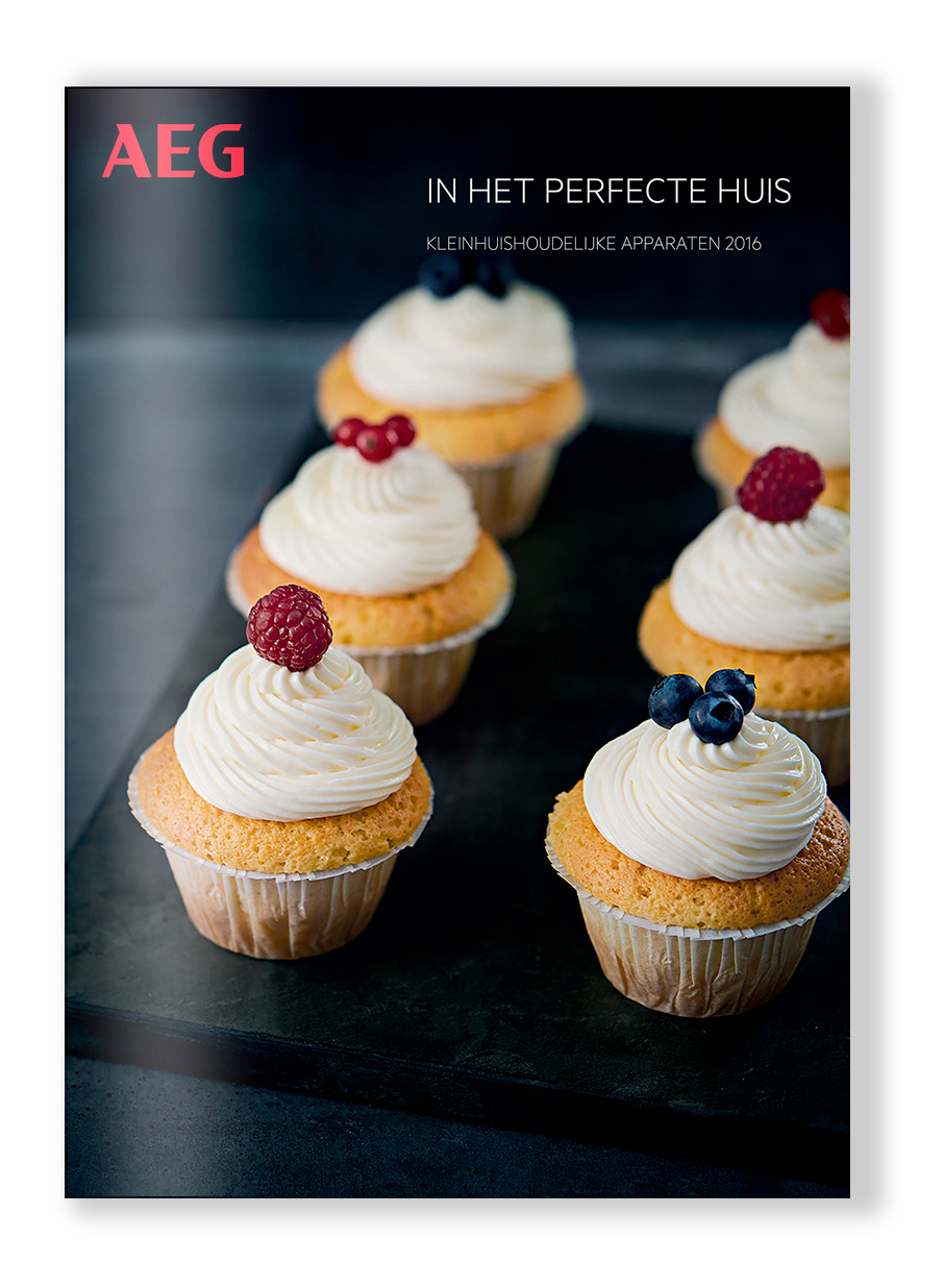
The story : following a strong strategic rebranding, AEG, the leading brand of the Swedish Electrolux group, wants to make a remarkable comeback on the stage of the household appliances. Among other communication tools, including on the point of sales itself, AEG focuses on a new image for its brochures and printed material.
"Our name stands for premium design and style. Therefore, our
logo needs to reflect and represent this reputation for excellence.
We have modernised its composition to optimise visibility, create
strong brand recognition and clearly identify who we are."
"Our distinctive photographic style is bold, inspiring and visually
engaging. The photographer’s creative flair and sophisticated
style should tell an evocative story and reveal our passion for
exceptional results."
"We are instantly recognisable, because our colours reflect the
premium style of our brand. The refined palette creates clear
standout and strong brand identity."
"Our typeface speaks our brand as clearly as the words we use.
The clean and refined style draws the eye of the consumer, and
enhances readability on products, print and digital applications."
"Our visual identity is an articulation of our brand
story and helps us to communicate our strengths to
consumers. We need our visual language to deliver
against two distinct criteria: functional and emotional."